A backcast of MPLY’s current monopoly portfolio would have turned $10,000 into $171,578 over the past decade, net of fees, if you held through the drawdowns.
Key Takeaways
- The reconstructed MPLY portfolio left the index far behind. The same $10,000 in the S&P 500 became $39,777, a 14.9% CAGR; MPLY’s current holdings, rebuilt backward, would have compounded at 33.0% a year, net of fees.
- Consistency backs the headline. The reconstructed portfolio would have beaten the benchmark in 90.4% of 2,258 rolling one-year windows.
- The ride would have been violent. The reconstruction’s maximum drawdown: −36.8% (12/27/21–10/14/22).
- The live fund trails its own backcast. MPLY’s live record shows +26.9% where the reconstructed book would have returned +81.6%. That gap is the hindsight bias, and it’s part of the story.
- The fee is the weak flank. A 0.8% expense ratio would have cost $14,145 per $10,000 across the window — and the backcast says the strategy justifies its fees anyway.
The MPLY ETF is having an identity crisis it didn’t ask for. Nearly every recent headline landing in its orbit is about MLPI, one ticker letter away: a covered-call midstream income fund whose distribution news keeps surfacing whenever someone searches MPLY.
The two funds share four letters and almost nothing else. MPLY is a monopoly portfolio: 49.8% of it sits in the Magnificent 7, and most of the rest follows the same control-over-competition logic. So which fund did you actually mean to find?
If you came for the income machine, I’ll point you back out politely. If you came for the monopoly book, I have numbers. I rebuilt MPLY’s current portfolio holding-by-holding (99.7% coverage) and backcast it from 8/16/16 through 8/14/26, net of fees.
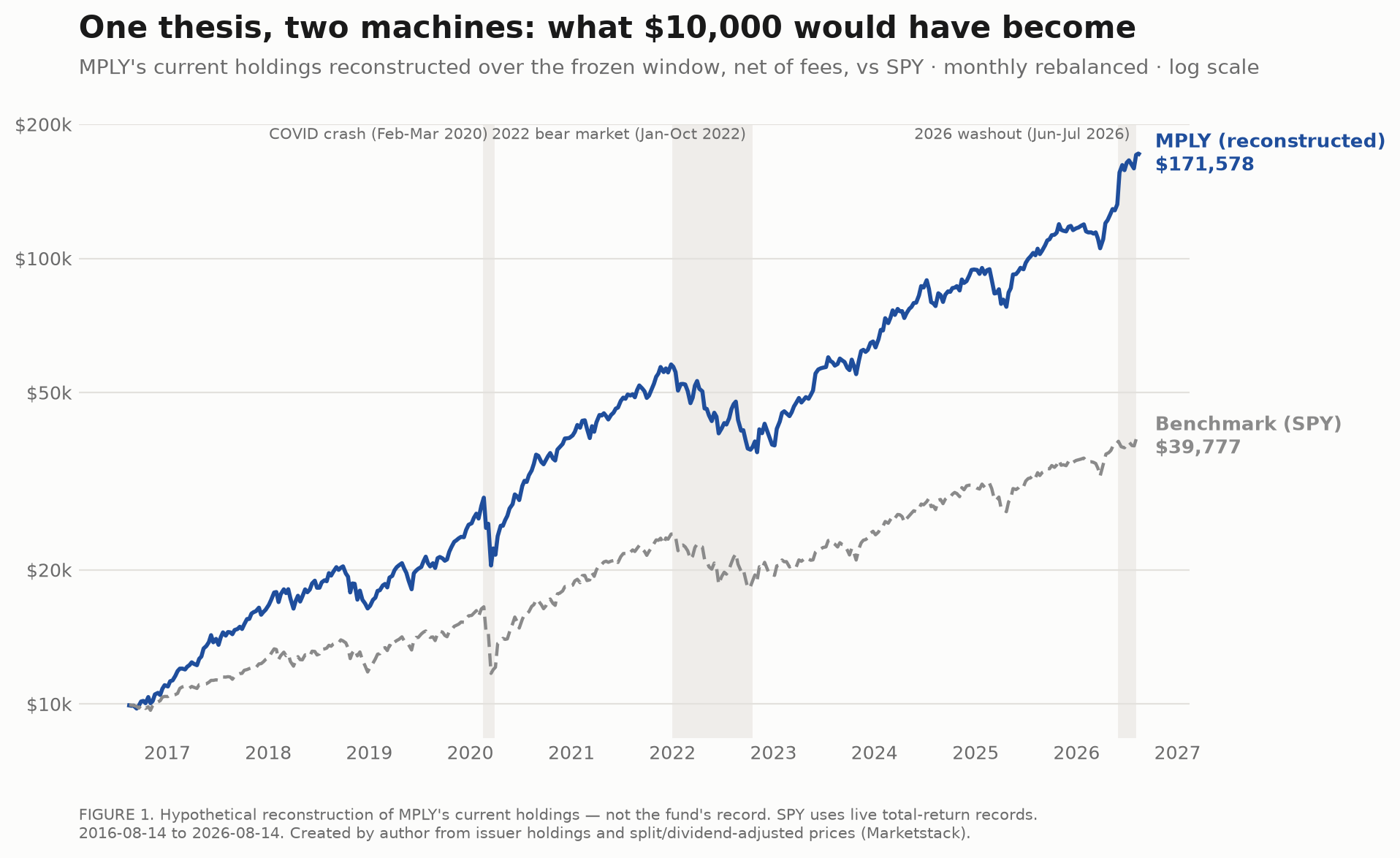
What the reconstructed monopoly portfolio would have done to a $10,000 stake versus the benchmark, 8/16/16–8/14/26. (Created by author using fund holdings and total-return data.)
MPLY vs. MLPI: One Letter, Zero Overlap
MLPI is built around midstream energy names, pipeline and storage infrastructure, plus a covered-call overlay: the fund sells call options on its holdings, trading away some upside for immediate premium income, then mails that income out as distributions. Its yield is the entire point of the fund.
To be fair to the other ticker: some of those distributions may be return of capital: your own basis handed back to you. That’s a tax-deferral tool when used deliberately, not an automatic red flag. But it does mean price charts mislead on income funds. Total return is the only lens that works here.
MPLY’s reality is the opposite. The fund launched on 5/16/25, holds $16,705,762 in assets (flying under the radar), and has paid exactly one distribution in its life: $0.039 per share, a 0.1% yield on its last close. Its price return and total return tell the same story, because there is effectively no income to add back.
The problem with new funds is that they’re usually too young to judge. So you interrogate the holdings instead of the launch hype.
One letter separates the tickers. Nothing else about them overlaps.
What the MPLY ETF Actually Owns
MPLY holds 100 positions, but don’t confuse the count with diversification. The top ten names carry 63.3% of the portfolio, and the Herfindahl-Hirschman index, a standard concentration gauge where higher means more concentrated, sits at 0.0502. This is a concentrated book by design.
The design has a thesis: the best companies do not compete. They control. Control means pricing power, the ability to raise prices without losing customers, and pricing power is what turns revenue into margins that survive competition. That is the entire mechanism. Everything else in this article hangs off it.
You can watch the mechanism in miniature. Across the full-overlap window from 7/2/26 to 8/14/26, the short stretch where every current holding has live prices, the portfolio returned +4.5%. Microsoft contributed +2.3%, Nvidia +1.5%, Amazon +0.6%. The drags were Tesla at −0.5% and Alphabet at −0.4%.
The toll booths carried the book. The story stocks argued among themselves.
· · ·
Anyone Can Look Like a Genius in a Bull Market
Anyone can be a “genius” in a bull market. Strategies earn their reputation in the windows when everything falls.
The reconstruction has lived through several. In the COVID crash window it fell −29.7%. Its worst single months were April 2022 at −13.6%, September 2022 at −11.0%, and May 2019 at −10.2%, the same 2022 stretch behind the maximum drawdown flagged in the takeaways above. Its best month printed +24.2%, which is what high-beta monopoly books do when sentiment turns back on.
The 2026 washout window is the odd one out: the reconstructed portfolio gained +22.9% across it.
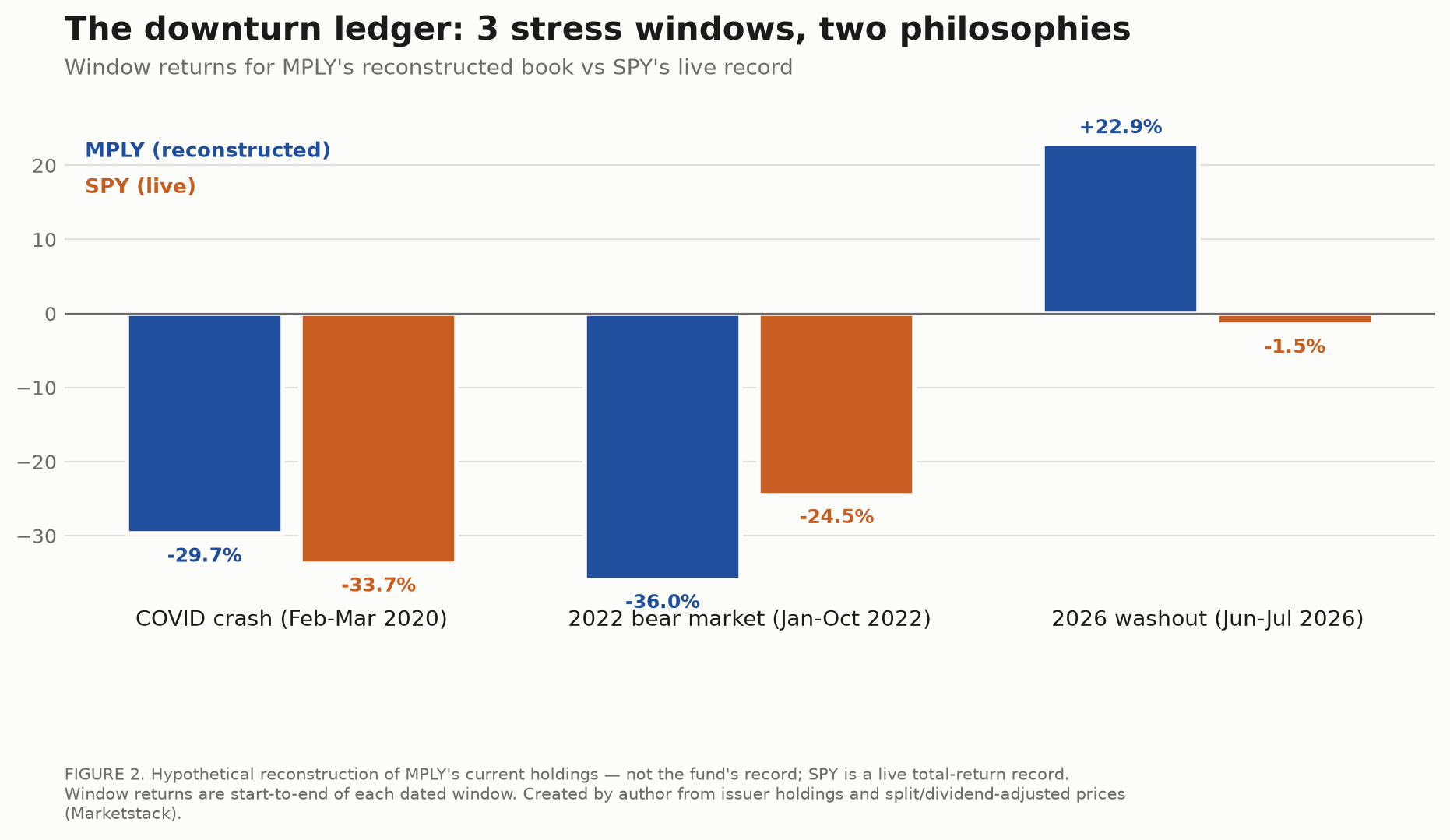
Where the reconstruction would have hurt most: peak-to-trough declines across the window. (Created by author using fund holdings and total-return data.)
Annualized volatility runs at 24.9%, and the beta of 1.22 means the portfolio amplifies the benchmark’s moves in both directions. The up-capture of 1.36 against a down-capture of 1.22 tells the real story: the book took more than its share of up markets and gave back slightly more than its share on the way down.
Concentration cuts both ways.
Could the hundred positions protect you in a crash? Diversification may sometimes protect investors in downturns — it may not. This book is diversified across tickers, not across risks. One factor, mega-cap growth sentiment, drives most of it.
And yet the risk-adjusted math held up: a Sharpe ratio of 1.30 (return earned per unit of volatility endured) is a strong showing for a book this jumpy.
The Gap Between the Live Fund and Its Backcast
Here is the part of the story most fund marketing skips.
The takeaways flagged it: the live fund’s return over the overlapping window badly trails what the same holdings would have done reconstructed backward. The overlap covers 264 trading days, and the weekly correlation between the two records is 0.96.
Read those together. The high correlation says the fund you can buy really is the book I rebuilt: same drivers, same direction. The gap in magnitude says something else: a backcast of current holdings flatters by construction.
Two biases do the flattering. Survivorship: today’s portfolio can only contain companies that survived to be in it, so the reconstruction can never own the would-be monopolies that died along the way. Hindsight: the weights themselves reflect what already worked.
The gap is the information. A young fund that tracks its reconstruction while trailing it is showing you how much of the shiny decade came from the strategy — and how much came from rewinding the winners.
[FIGURE 3: Live fund vs. reconstructed portfolio over the overlapping window]
Same book, two records: the live fund against its own backcast. (Created by author using fund NAV and reconstructed total-return data, through 8/14/26.)
· · ·
So, What Does Typing MPLY Actually Buy You?
The best ETF to buy right now really depends on the job each fund is hired to do. The ticker confusion is useful precisely because it forces the question.
If the job is monthly income, MPLY is the wrong hire — and now you know which letter to change. Judge that fund on total return, after tax, with return of capital accounted for, not on its headline yield.
If the job is a growth satellite built on durable market control, MPLY is one of the cleanest expressions of that idea available in a single ticker. “Cleanest” means the portfolio actually matches the thesis, top to bottom. You accept the fee. You accept the drawdowns. You accept that a short live record is backed by a flattering reconstruction.
That is the trade. It was never supposed to be for everyone.
The Bottom Line
Verdicts are role assignments, so:
- MPLY is best suited for investors who believe durable control beats headline growth, want that exposure concentrated in one ticker as a satellite, and can hold through a drawdown deep enough to test conviction without selling.
- It is poorly suited for income seekers (the fund they read about is one letter away) and for investors whose core already leans heavily on mega-cap US index funds. For that second group, MPLY duplicates the leaders they already own rather than diversifying them. Concentration is the feature; buy it only if concentration is the assignment.
- And if you arrived from an MLPI headline: nothing here changes your decision. Just make sure the symbol you trade is the symbol you meant.
The portfolio is exactly what it claims to be. Whether that claim fits your account is the only question left.
FAQ
Is the MPLY ETF the same as MLPI?
No. MLPI is a covered-call fund holding midstream energy infrastructure names and paying out option income as distributions. MPLY is a concentrated equity portfolio of companies with dominant market positions, tilted toward mega-cap technology. They sit one letter apart and have nothing in common.
Does MPLY pay dividends?
Effectively no. MPLY has paid a single small distribution since launch, and its yield rounds to zero — this is a price-appreciation vehicle, not an income vehicle. Investors seeking regular payouts are thinking of the covered-call midstream fund one letter away.
Is MPLY a good ETF to buy right now?
For most investors, the sensible default core is a low-cost broad index fund such as VOO or VTI. MPLY is a concentrated satellite built on monopoly power — a role player, not a foundation. Consider your own goals, time horizon, and drawdown tolerance before sizing either one.
What does MPLY invest in?
Companies with durable market control — businesses that can raise prices without losing customers. The portfolio tilts heavily toward mega-cap platforms, with the Magnificent 7 as its engine, plus a tail of smaller names that fit the same monopoly logic.
How risky is MPLY?
More volatile than a broad index fund, with deep double-digit drawdowns in its reconstructed history and a portfolio concentrated in a handful of mega-cap names. It is diversified across tickers, not across risks. Position size accordingly, and expect a bumpy ride.
Methodology & data
This analysis is a backcast, not a backtest. A backtest simulates fixed rules across history; a backcast rebuilds a fund’s current portfolio and asks how that exact basket would have performed across the analysis window (8/16/16–8/14/26). I rebuilt MPLY’s holdings at their current weights, applied the fund’s stated expense ratio annually, and measured total return, with SPY as the benchmark on the same basis. Holdings coverage was near-complete; the small gap sits in the data room.
Backcasts flatter by construction: the portfolio contains only companies that survived to be held today (survivorship bias), weighted by what already worked (hindsight bias). The live-versus-backcast gap in the takeaways measures that flattery — it is not a promise about the next decade. The live fund also trades and rebalances in real time, while the reconstruction holds a frozen allocation, so the two records answer different questions. Attribution covers only the full-overlap window in which every current holding had live prices.
This is analysis, not a recommendation. Figures, code, and holdings files: [DATA ROOM LINK]